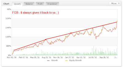
Now is that beautiful or what? This is up to date with the last trades taken on Jan 11,2013 at which time the bot gave us about 700 pips. The red line I drew on the top of the relative equity curve shows a nice steady gain to the north. The equity curve or what actually was traded, displays the equity in relation to drawdown (DD) which is the red line below the one I drew. This illustrates how to trade this robot and that we should not worry too much about the losses we incur. If our risk is set at a level we are comfortable with things will work out for the best.
Even at the worst DD around July and August of last year we see the market quickly gave back those losses and recovered to the red line I drew on the top.
Remember this is a real money account started by the vendor back in Dec. 2010. Yes the DD can be a little tough to handle at times but if we stick to our money management plan and think long term with this robot, we will be just fine
Speaking of money management I have a good outline of lot sizes to use with this robot below:
- Low Risk - .01 Lots per 1000USD Traded
- Medium Risk - .01 Lots per 500USD Traded
- High Risk - .01 Lots per 250USD Traded
Use the chart above in regards to your risk appetite.

